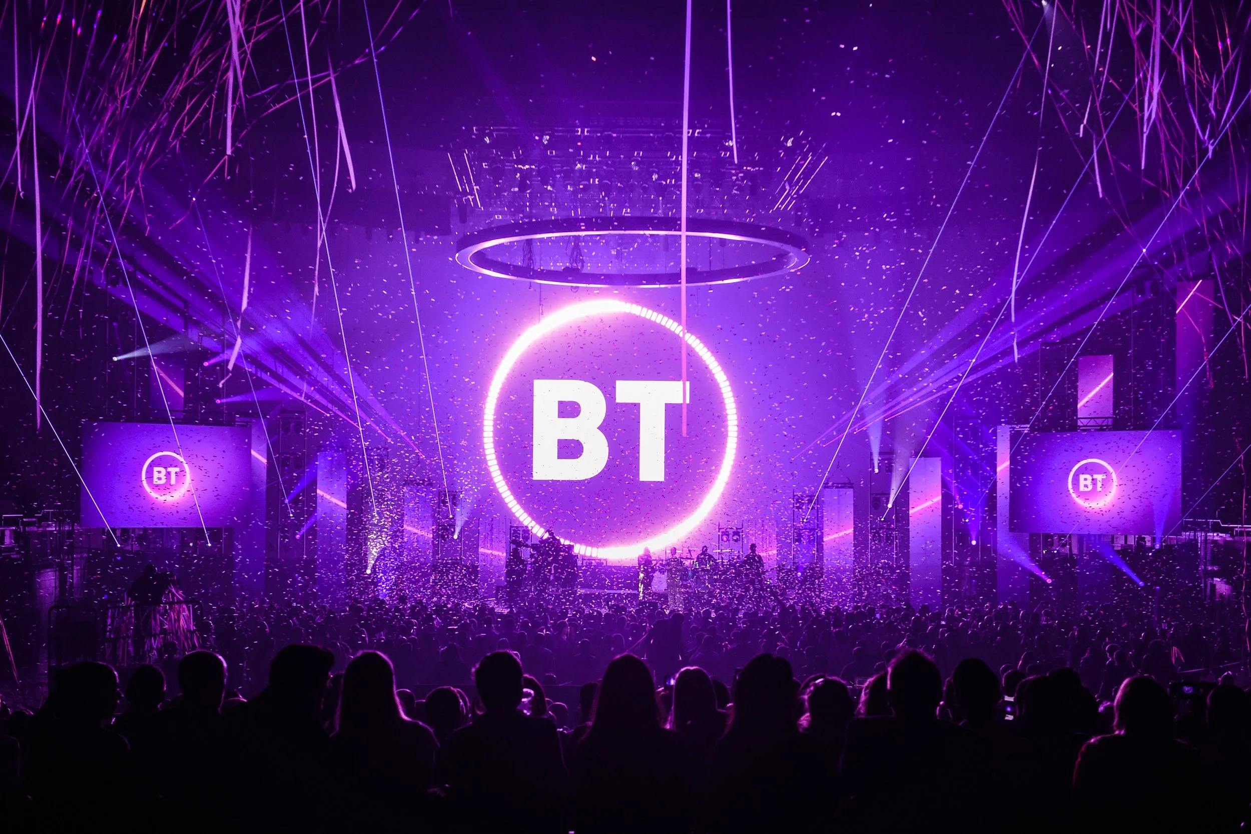
Part of the design team working on the 2019 BT brand identity development.
Creative Direction takes many forms. I was asked to be Creative Consultant for Hiscox for the commissioning of their first art installation in their new London Headquarters. My role included writing the creative brief, sourcing artist selection, artist panel selection and liaising with chosen artist Julie Freeman during the development and installation process.
Julie Freeman works with natural systems and emergent technologies. Since the 1990s her large scale installations have pioneered her conceptual and critical approach to working with data as a living art material. Exploring climate prediction as a game of chance and of skill, More Than Us offers us a glimpse of the astronomically huge dataspace we exist in.
Two communities of colourful geometric shapes drawn from 'Suprematist' paintings of the early 1900s, congregate, ebb and flow in response to historical and predictive climate catastrophe data sets. Both communities move randomly to find interesting places in ‘landscapes’ created by the data. Engaged in a game of chance, some navigate raw, unstructured data. Others exhibit a more purposeful behaviour as they are driven by pronounced data patterns emerging from an artificial neural network.
At the heart of the ever-changing composition, ‘splinters’ from the ‘data spine’ represent real-time digital transactions across the Hiscox businesses. More Than Us reminds us to think in a more-than-human way, and that even with sophisticated data, chance and randomness will always have a hand in our collective fate.
The climate catastrophe data sets have been built using data from our Hiscox partners RMS and Verisk.
Creative Director for Love Hemp’s first advertising campaign with British boxing icon Anthony Joshua. Work included brand strategy development, joint value proposition, campaign concept development and activations.
The national campaign featured a TV advert on ITV, on-demand platforms, including ITV Hub, All 4 and Sky, print media adverts in Metro nationwide, and multiple outdoor advertising formats in London, Manchester, Liverpool, and the Northeast.
“This is a hugely exciting moment for Love Hemp and our journey to become a global leader in CBD wellness products. We are privileged to have the support from our investor and ambassador, Anthony Joshua, as we work to educate everyone on the benefits of premium CBD products for achieving optimal health and wellness,” added Tony Calamita, co-founder and CEO of Love Hemp.
Brand strategy, identity and launch material for the world’s most advanced blood analytics platform.
FitnessDX core product, the analytics report, was rebuilt from the ground up. All data visualisations were reviewed and re-designed to improve accessibility and readability.
The report was brought in-line with the new visual identity and then reprogrammed as a digital first platform.
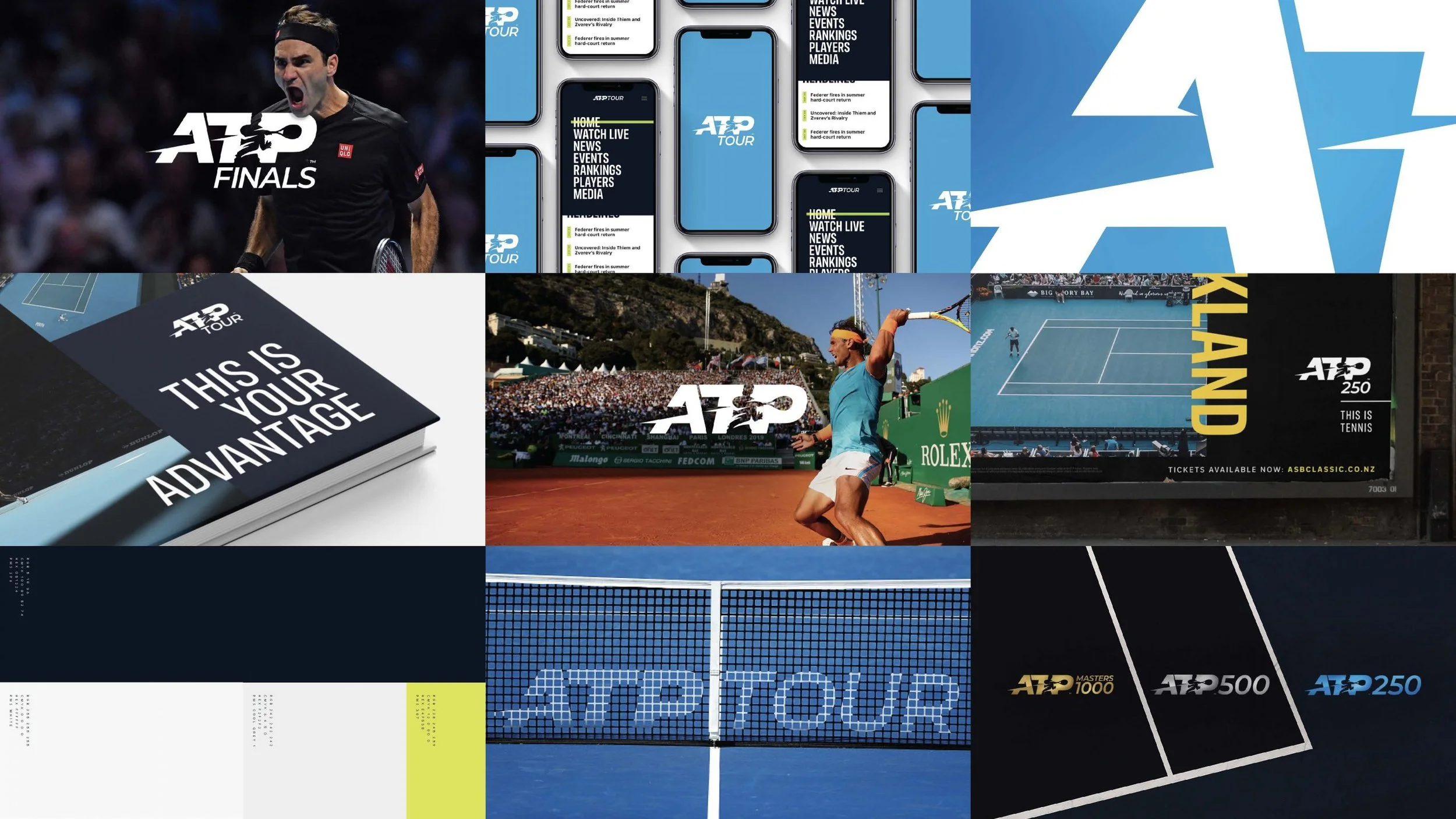
Part of design team that created new identity for the Association of Tennis Professionals.
Concept, storyboard and artwork for explainer animation for the learning experience platform, HowNow.
Helping the world’s learning company transition from a disparate holding company to a consumer-facing brand.
Work involved visual identity development and roll out for a number of Pearson owned global brands in the US, Asia, South America and Europe.
Mayhew has provided shelter and refuge for animals in need since 1886. A bold update to their identity brings together a logotype combining a dog and cats tail, a vibrant colour palette, photography that draws on the chemistry between people and their best friends.
HSBC needed an internal engagement identity and comms platform for their new global SME banking offering ‘Fusion’ to inform and excite the HSBC teams responsible for marketing the new SME banking offer.
Work included building the communications platform, establising a visual identity system and design templates for digital applications, social media assets, direct mail and engagement activations.
Icon suite for one of the largest European logistics real estate companies, Logicor. Designed in collaboration with digital agency Célibataire.
Report concept and design for KAUST Innovation, who exist to advance scientific knowledge that creates impact, focusing on four areas of global significance – food, water, energy, and the environment.
Design lead on development of Thames Water brand identity 2019.
Design lead on Brand guidelines for one of the largest professional engineering institutions in the world.
Creation of the design system for Molten Annual Report, the inaugral report showcasing their new brand identity.
The theme ‘Multiplying Opportunities’ was established to draw together all the positive impact initiatives FedEx are engaged with as part of the Global Citizenship programme.
Creative direction built on the hidden arrow within the iconic FedEx logo.
The theme was used as the central narrative for their 2018, 2019 and 2020 reports.
What’s inside Home Retail Group?
Since work began with Home Retail, the aim has been to produce a reporting suite that not only describes succinctly what the group does, but also communicates the investment case in a clear and credible manner.
To support this, there are a number of compelling stories which we have bought to life through the use of various forms of media - creating a rich and engaging online experience for shareholders, customers and employees.
Each year the report & supporting media has had it’s own unique creative concept - at the heart of which has been the group’s major brand asset - the box.
In 2015 Royal Mail were going through a period of significant change. They were re-positioning the business to talk more clearly to customers about their offer. I joined the Royal Mail team as lead designer to improve their design system and create new brand guidelines.
Visa Europe needed to develop a visual language to communicate their new ‘Always On’ proposition. Central to the concept, the Pulse graphic was developed into a bold new identity system incorporating the iconic Visa colours. The Pulse visually and dynamically articulates Visa’s centrality to a constantly moving and evolving 24-hour payment world. Offering great flexibility and extensive digital possibilities, the Pulse graphic is immediately recognisable as Visa, whether used as a whole or in sections. The visual language flexed across their product offerings from Standard through to Premium, each with their own unique look and feel.
Bringing ‘a year in review’ to life in a new magazine style design for AstraZeneca’s 2015 review.
The Berkeley Foundation is the independent charitable foundation set up by the Berkeley Group.
The central theme from the new strategy combines with impact messaging into headlines provides more emphasis to the social impact of the Foundation for their Annual Review.
Personal hero stories punctuate the review providing pace and increase engagement by bringing the reader closer to the individuals or families who’s lives have been transformed with the help of the Foundation.
An illustrative ‘community landscape’ by the talented Down the Street illustrators brings the work of the Foundation to life, highlighting their four areas of focus; a safe place to call home, access to employment, the skills to succeed and health & wellbeing.
Improvements made to the data visualisation, introducing a new giving map and re-structuring data points ‘by investment’ and ‘by impact’. Achievements are enhanced by providing context to the data through the introduction of legacy information.
Helping Chartered Institute of Highways and Transportation evolve their identity. The new shortened name, which is already widely adopted is introduced to the logo, making it more easily recognised and work better across digital channels.
Just launched, this work is still ongoing, and will be rolled out over the next year across members communications and events.
Creative Lead on Brand Development and Marketing Strategy for what became the UK’s fastest growing private pension provider NOW: Pensions, facilitating a phenomenal growth from clean slate to over 800,000 members in less than 4 years.
Interviews with key personnel within the company got under the skin of the culture and identify touch points within the business' products and services which deliver tangible reasons to believe in the defined proposition 'Smarter. Simpler. Better.' – expressing their commitment of always challenging the status quo and providing their clients with the best possible pension provision.
Helped NOW: Pensions achieve their business objectives and drive their multi-channel marketing and communications strategy forward, delivering a range of consumer and co-branded sports sponsorship campaigns using traditional, digital and social channels.
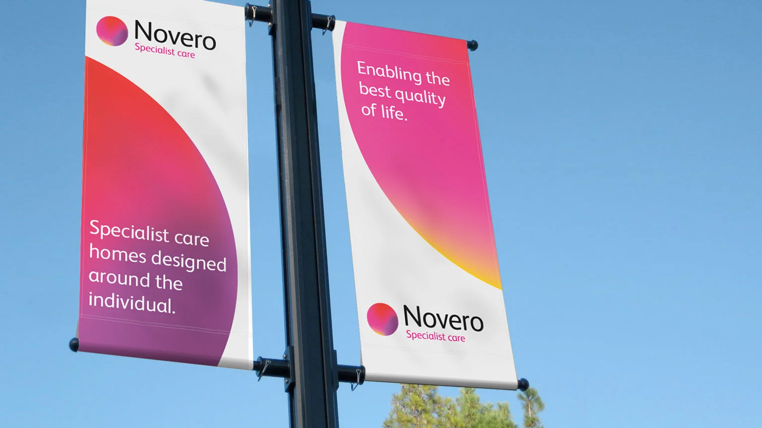
Select Healthcare are a well respected group of care homes with over 20 years of experience. They were looking to strengthen their specialist care business with new purpose built homes for treating conditions such as Acquired Brain Injury, Motor Neurone Disease and Stroke.
Initial involvement was helping to create a name for the specialist care part of the business. Concepts of 'new' and 'freedom' lead to the creation of a unique name –Novero.
Novero was then given a visual identity focused around the concept of 'enhancing life', re-enforced though the value proposition 'Designed around the individual to enable the best quality of life'. The sun provides a symbol of vitality and clarity, while the sun colour spectrum provides a graphic language.
An image library supporting the new brand was created with a focus on patient care.
One in five of the adult population in the UK has arthritis. Arthritis Research UK, the fourth largest charity in the UK, play a vital role in research and public information for arthritis.
I worked with the charity to re-design over 60 public information booklets from the ground up, covering all conditions, therapies and self-help.
User focus groups were used to validate all design features enquiring design was best suites to those living with the pain of Arthritis.
The brief was simple: create a design that makes what can be quite difficult reading matter easy to assimilate. Created a design that uses photography, bold brand graphics and clear illustrations to bring a pragmatic and visually consistent design system to all titles.
As part of the project created a suite of specially commissioned photography that reinforces the new brand launched in 2009.
Since launch the demand for booklets has risen by 150%.
Helping the NHS report on their Cancer Screening Programmes.
I worked with the NHS Cancer Screening Programme for several years, helping them bring their corporate reports to life. Year on year, the task is to visually support the challenging subject matter in a sympathetic manner whilst leading readers through the report.
Coats was founded in 1755 in Scotland. Since then they have been supplying yarn, sewing and needlework products to a wide range of markets around the world.
Coats’ products are part of the fabric of everyday life.
Creative partner with Coats to help create the identity for new sample service 'Colour Express'. The process started by helping Coats' communication team define the service proposition to their customers. Articulated as Fast, Accurate, Colour, the tone was set for the service brand, and its brand promise.
The visual identity sought to support this promise. The defining signature for the service is Prism, a multi coloured dynamic visual property that captures the spirit of Coats Colour Express.
Arthritis Research UK are one of the top four medical research charities. In 2011 they set their ambitious research strategy for the next ten years.
The design concept brought together two key elements at the heart of their research. The harnessing of data and the hardworking people who represent the charities activities throughout the UK.
Simple infographics provide a valuable insight to how and where the charity support research throughout the UK, whilst portraits of key members of staff allow a view into the activities of the people behind the research.
The resulting report demonstrates the charities leadership position and passion for success in creating a future free from the pain of arthritis.
The leaders in car innovation Mercedes-Benz we looking for a new identity for their unique Under 16's Driving Experience.
A bold and dynamic system interacts with the car and other communications promoting a passion for adventurous driving.
Work extended to their other driving experience identities, including 4x4 and Under 17’s.
Anglo Pacific invests internationally in a variety of mining companies including coal, gold and iron.
Creative partner with Anglo Pacific to create an elegant, distinctive visual identity that elevates the company’s look and feel, now better placed to continue their business success.
Identity olled out across corporate stationary, marketing material, corporate reporting and quarterly results materials.
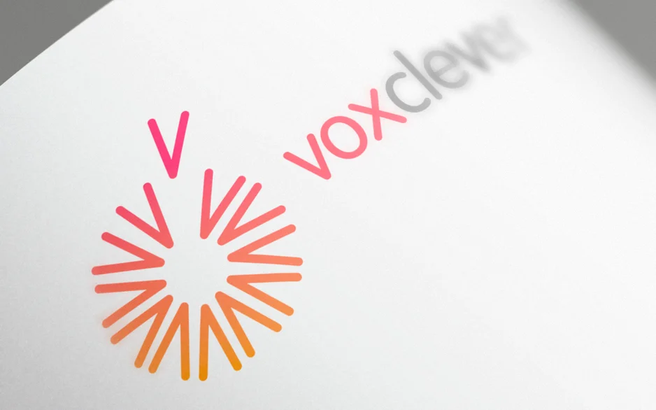
voxclever offers businesses the freedom to take their telecoms and IT solutions wherever they go. Whether that's on the move or moving offices.
Helped them through the process of naming the service ‘voxclever’ and implementing the brand across all media. The dandelion motif was created to express the feeling of freedom. This is supported visually and verbally by a simple and straightforward language reinforcing the company’s philosophy that ‘telecoms and IT shouldn’t be hard work, should they?’.
Report design for Royal Academy of Engineering Diversity and Inclusion Toolkit. The toolkit is designed around recognised diversity and inclusion themes with a focus on seventeen case studies from engineering organisations aiming to increase diversity and inclusion. It contains diversity statistics, a business case for diversity and inclusion in engineering, tools from Pearn Kandola, guidance on specific initiatives, useful resources and sources of information.
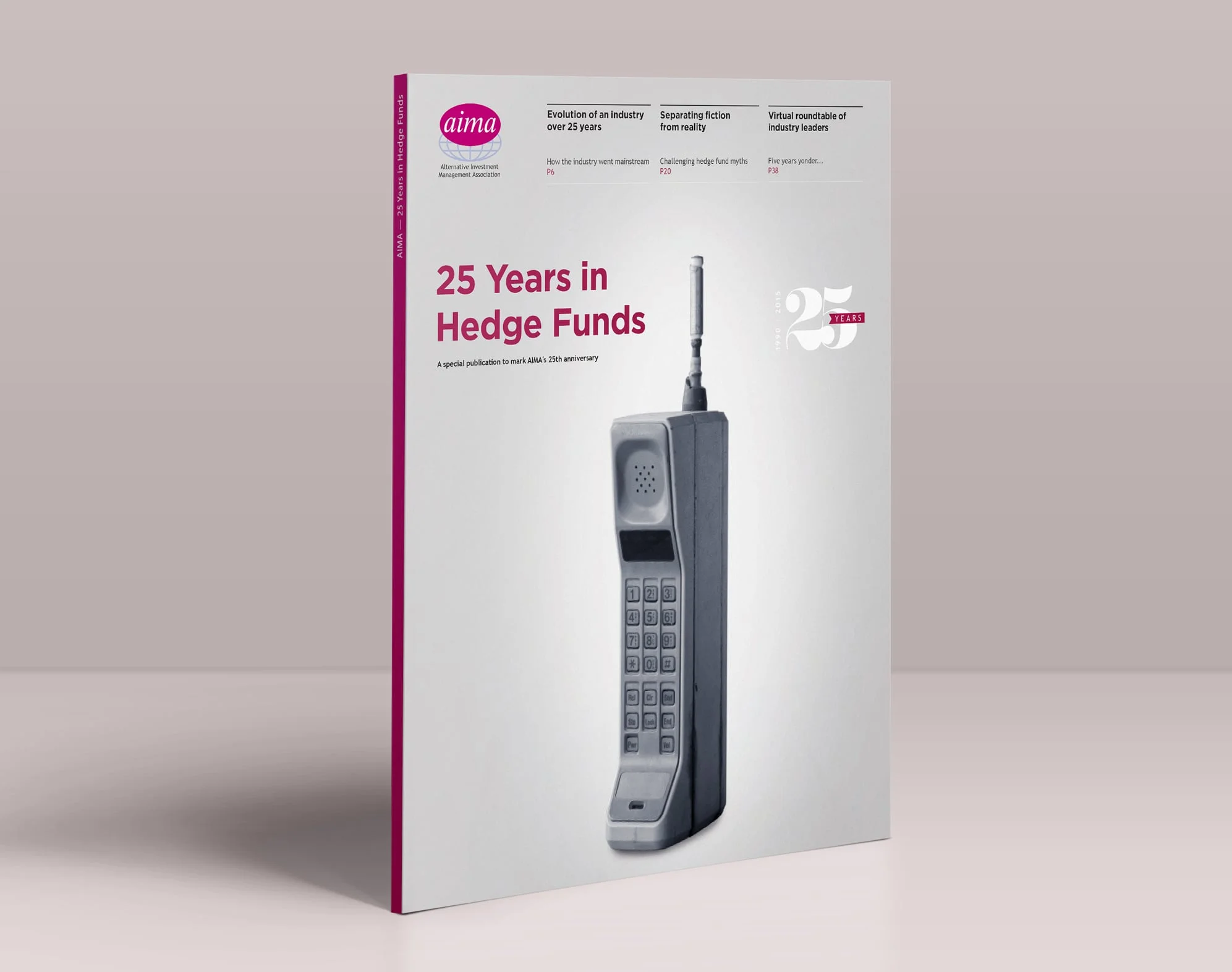
Design of a special publication marking 25 years of Hedge Funds.
Encouraging Government to create a better connected Britain.
Helped Microsoft design their technology manifesto presented to key decision makers in Government at the Labour Conference 2014.
Important issues such as protecting public online, accelerating economic growth and building a truly digital government are brought to life with lifestyle imagery and a vibrant full spectrum colour palette.
CIHT supports transport professionals, and the industry as a whole, raising their voice in the national debate, furthering their knowledge and strengthening the networks that exist amongst them.
CIHT launched an ambitious member recruitment drive, and asked for help to develop the campaign concept and deliver across multiple channels. The recommendation was to make Members ambassadors of the benefits of CIHT membership. I devised a campaign with its feet firmly in social media encouraging members to 'share their stories' of how their careers have gone further with the help of CIHT. #journeys launched with five feature stories from across the industry, representing senior Fellows to 'second jobbers'. The Multichannel campaign launched across Member Get Member, events and social media.
Launched in the third week of June, the response from the members community has been very positive. Even before the launch had taken place members were coming forward to share their stories and senior board members keen to present their #journeys as part of their event presentations.
“We all make journeys every day. CIHT will be looking at how we can make the journey better for the customers on our transport networks. We need to make the journey better, safer, healthier, more integrated and more reliable.”
David Gibby, President, CIHT
Smart engineering, smart design system
A graphic language of macro detailing in charts and graphs to reinforce the high level of engineering credentials of Meggitt, twinned with featured product spreads projecting themes of speed, intelligence and the extreme environments with which they operate within.
“I was very impressed myself with the conference which has stepped up a league from even a couple of years ago”.
Principal, Aon Hewitt
Creative partner with leading fund manager Hermes as both creative and delivery experts, to help create their key Investment Conference 2013.
Articulated the conference theme ‘expanding your investment prism’ into a set of scalable and movable visual assets which we applied to animation, projections, stage sets and delegate iPad App.
Working with the award-winning building Kings Place, London delivered numerous conference room staging designs including a bespoke 3-D surface set. Also created an introduction film spanning the history of Hermes and introducing the conference.
A live projection wall was created to allow up to the minute notices and calls to sessions. Interactive iPad apps were created to guide delegates through the agenda, with the facility to ask a question, take notes and collect presentations into a basket for future reference.
414 people attended of which 230 prospects worth >£370billion. The event attracted £117,000 PR value from press including The Economist, Wall Street Journal, BBC and Bloomberg.
“very ‘a la mode’ and takes your business brand image away from the traditional ‘stuffy’ or plain and simple ‘OTT’ City-types format”.
Cicero Consulting
Going about your business
Petrofac are one of the world’s leading oilfield service companies. A reportage style takes readers through the incredible day-to-day activities of the business, driven by key messages of creating, supporting and developing.
The Right First Time initiative was all about embedding the behaviours across Openreach that would iron errors out at every stage of the process.
The project included support materials for managers to use in face-to-face engagement sessions with their teams, event materials, and templates that managers could use to recognise individuals and teams who were hitting Right First Time targets.